Use it correctly, or use the monochrome one.
Everything here is generated from the live design system — the swatches are the same custom properties the site runs on, and the SVGs are the ones the header renders. Copy or download anything. No permission form, no asset request queue.
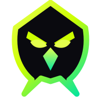
A hood, a beak-line and a core — in that order of importance
The silhouette is the recognisable part. If a reproduction can only carry one element, it is the outline; the internal detail may be dropped below 20px, and the monochrome variant already does.
The primary mark also lives at assets/mark.svg and the rounded app icon at favicon.svg. Both are plain SVG with no external references — the gradients are inline, so a copy-paste into a deck works.

Clear space, minimum size, and where the mark may sit
- Clear space is x on every side, where x equals half the mark’s height. Nothing — type, rules, other logos, image edges — enters that box.
- Minimum size: 20px digital, 8mm print for the full mark. Below that, use the monochrome variant, which drops the internal detail.
- Lockup minimum width is 120px. Under that the wordmark stops being legible before the mark does, so use the mark alone.
- Optical centring, not mathematical. The mark’s visual centre sits about 4% above its bounding-box centre because of the shoulder flare. Our own header accounts for this.
- Backgrounds: void black, any surface darker than #1A1A22, or plasma white. Nothing in between — mid-greys kill the gradient edge.
Do, and do not
Full-colour mark on void black. This is the default and it should be most of what you use.
On plasma white, using the light variant. The gradient edge is unchanged; only the hood fill inverts.
Do not stretch. Scale uniformly or not at all — the hood geometry is the identity.
Do not rotate. The mark is always upright, including in loading states and animations.
Do not recolour outside the palette. If a single colour is needed, use the monochrome variant.
Do not place it on a busy field. Use a solid panel, or the monochrome variant knocked out.
Also: no drop shadows, no outer glow, no bevel, no gradient overlay on top of the existing gradient, and never rebuild the lockup by setting the wordmark next to the mark yourself — the spacing is optical and the supplied file already has it.
Eleven tokens, and the job each one has
Select a swatch to copy its hex. These are read from the same custom properties the site renders with, so what you copy is what is live.
Usage rules
- Robin Neon is for one thing per view: the primary action. If two things are neon, neither is primary.
- Neon Light replaces Robin Neon for text under 16px — the pure neon vibrates at small sizes on black.
- Teal is a second series, never a second brand colour. It terminates gradients and separates data series.
- Crimson means a loss or a block, never decoration. Amber means waiting for a human.
- No surface is flat. Every panel is a gradient, a noise field or both — the palette assumes depth.
Contrast
Gray Dim fails AA for body copy and is restricted to metadata, timestamps and axis labels at 12px or above — never for anything a reader must parse.
Two families, no exceptions
Space Grotesk carries everything a human reads as language. JetBrains Mono carries everything a machine produced: numbers, hashes, addresses, latencies, code.
Aa Gg Rr 0123
Intent settled
Headings use text-wrap: balance so a title never leaves one orphaned word. Body copy is never centred.
0x71C7…9A2f
128,904 · 340ms
font-variant-numeric: tabular-nums is always on. A price that shifts horizontally while it updates is a bug, not a style choice.
<link rel="preconnect" href="https://fonts.googleapis.com">
<link rel="preconnect" href="https://fonts.gstatic.com" crossorigin>
<link rel="stylesheet" href="https://fonts.googleapis.com/css2?
  family=Space+Grotesk:wght@400;500;600;700
&family=JetBrains+Mono:wght@400;500;600&display=swap">The anti-slop rules, stated as constraints
Every one of these is enforced in review, and most of them are visible in the stylesheet as a thing we deliberately did not do.
- No stock imagery, ever. Every visual on this site is generated at runtime — canvas portraits, procedural avatars, hand-built SVG, WebGL. There is not one photograph.
- No flat surfaces. Every panel is a gradient, a noise field or both. Flat fills read as unfinished against this palette.
- No centred body text. Headlines may be left-aligned or nothing. Long-form copy is always ragged right, always under 76 characters.
- No default icon sets. The glyph system is seven CSS shapes — dot, ring, diamond, arc, dash, bar, square. If a concept needs an eighth, it needs a diagram instead.
- No number without a source. Live figures name their feed. Simulated figures say “simulated” adjacent to the number, not in a footnote.
- No decorative motion. Animation communicates state change or spatial relationship. If it does neither, it is deleted rather than slowed down.
Two easings, one duration scale
cubic-bezier(.16,1,.3,1) for entrances and anything that arrives. cubic-bezier(.4,0,.2,1) for state changes on something already present. 250ms for UI, 450–850ms for reveals. prefers-reduced-motion collapses everything to a fade.
1280px shell, asymmetric inside it
Twelve columns, 24px gutters, a 4px spacing scale. Section content is deliberately off-balance — a 1.12 / 0.88 split rather than 50/50 — because symmetrical layouts read as templates.
Specific, technical, and willing to say no
Name the mechanism. Give the number. State the limit in the same paragraph as the claim. No “seamlessly”, no “empower”, no exclamation marks, no emoji anywhere in the product or the marketing.
Take what you need.
Press, integrations and community projects can use these assets as supplied without asking. The one thing we ask back: do not modify the mark, and do not imply a partnership we have not announced.